REBRAND / PACKAGING
T&T
T&T Supermarket is a well-known Canadian supermarket chain that specializes in offering a diverse selection of Asian groceries and products.
The store is renowned for its extensive product offerings, which encompass imported goods and unique items not commonly found in traditional grocery stores. It stands as a celebration of diverse cultures, flavours, and experiences, dedicated to crafting an immersive culinary adventure that bridges continents and cultures.
T&T's fictional rebrand aims to breathe new life into the store by crafting a vibrant new identity. This involves a thorough rebranding effort to pinpoint areas for improvement, highlighting both strengths and weaknesses within the project. It includes developing a fresh visual identity and making subtle adjustments to the company's name, all in line with the refined positioning of the brand.


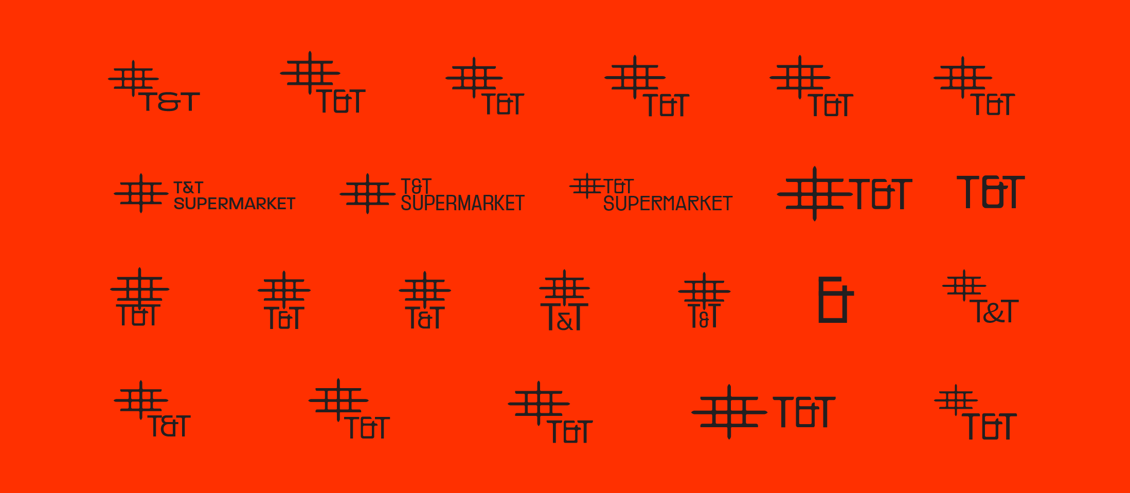
A pivotal aspect of T&T's rebranding process was to streamline the brand identity, starting with the elimination of the secondary brand name "Supermarket". This strategic move aimed to consolidate the brand into a singular, robust, and strong identity—T&T— ensuring a cohesive and impactful brand image.
After many ideations, the refreshed logo captures the essence of T&T's vision. With its distinctive lantern shape, it acts as a beacon of light, symbolizing the cultural connections across Asia. Its purpose is to warmly welcome all T&T customers, inviting them to embark on a vibrant journey of culinary exploration and forge meaningful connections between food and cultural experiences.
Inspired by the vibrant energy of Asian night markets and the convergence of diverse cultures, the rebranding initiative functions as a gateway, symbolizing the culinary journey along the Silk Road from Asia to North America.
The choice of bold and vibrant colors in the palette reflects the lively fusion of diverse cultures, mirroring the signs and lights found in bustling Asian communities. This deliberate selection, coupled with the subtly unique typography, adds depth and character to T&T's overall identity, creating a visually engaging experience for customers.
The incorporation of distinctive photography is more than just a design choice—it's about capturing the vibrant spirit of Asian culture.
Through inverted and monochromatic close-up shots, T&T's new identity brings to life the bustling energy and tantalizing flavors of Asian cuisine. This visual storytelling isn't just about aesthetics; it's about creating an immersive experience for customers, one that sets T&T apart from its competitors and makes shopping a journey of discovery.
Moreover, the pathway pattern isn't just a design element; it's a symbol of connection and belonging. Like the historic Silk Road that united distant lands, this pattern represents the journey of culinary exploration, bringing together diverse Asian cuisines under one roof. It's a familiar thread that resonates with T&T's primary audience—immigrants from all walks of life seeking a taste of home and a sense of community. In this way, T&T becomes more than just a supermarket; it becomes a place of familiarity and comfort, where customers feel welcomed and understood.
Ultimately, these design choices serve to strengthen the bond between T&T and its loyal community of food enthusiasts. By capturing the essence of Asian culture and creating a space that feels like home, T&T becomes not just a destination for groceries, but a hub for cultural connection and culinary exploration.


